

Burnish and Plumb
A modern brand refresh with a nod to an established identity.
Burnish and Plumb Construction Company was established in 2005 with a promise of finish and craft. Thirteen years later, their core mission remains the same, but their growth and expansion begged for an evolution of their visual identity.
Friends of Ours was asked to provide branding, production, and consulting services to deliver a fresh take on the brand with a nod to its existing identity.
The new logotype evolves the brand to a more flexible system working in contemporary applications. Secondary elements and an underlying grid communicate refinement, strength, equanimity and expertise.
We worked alongside Smith Brand who identified and directed the brand’s attributes that informed the new visual identity and marketing materials.
Services
Strategy
Visual Identity
Marketing Materials
Print Collateral
Art Direction
Consulting
Graphic Design
Production
Friends and Collaborators
Smith Brand
Noah Marion
Koch Printing
Karst Goods

Handcraft has been central to the Burnish and Plumb brand since day one. The mark reimagines the use of a ‘caliper’ as a graphic device. It is a measured nod to the previous visual identity—strongly topping off the confident advance of the ‘foot’ in the custom built ampersand.

Polished Precision
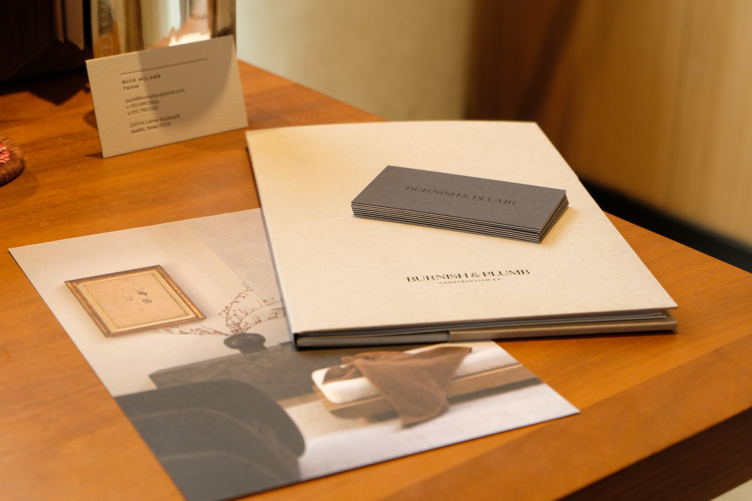
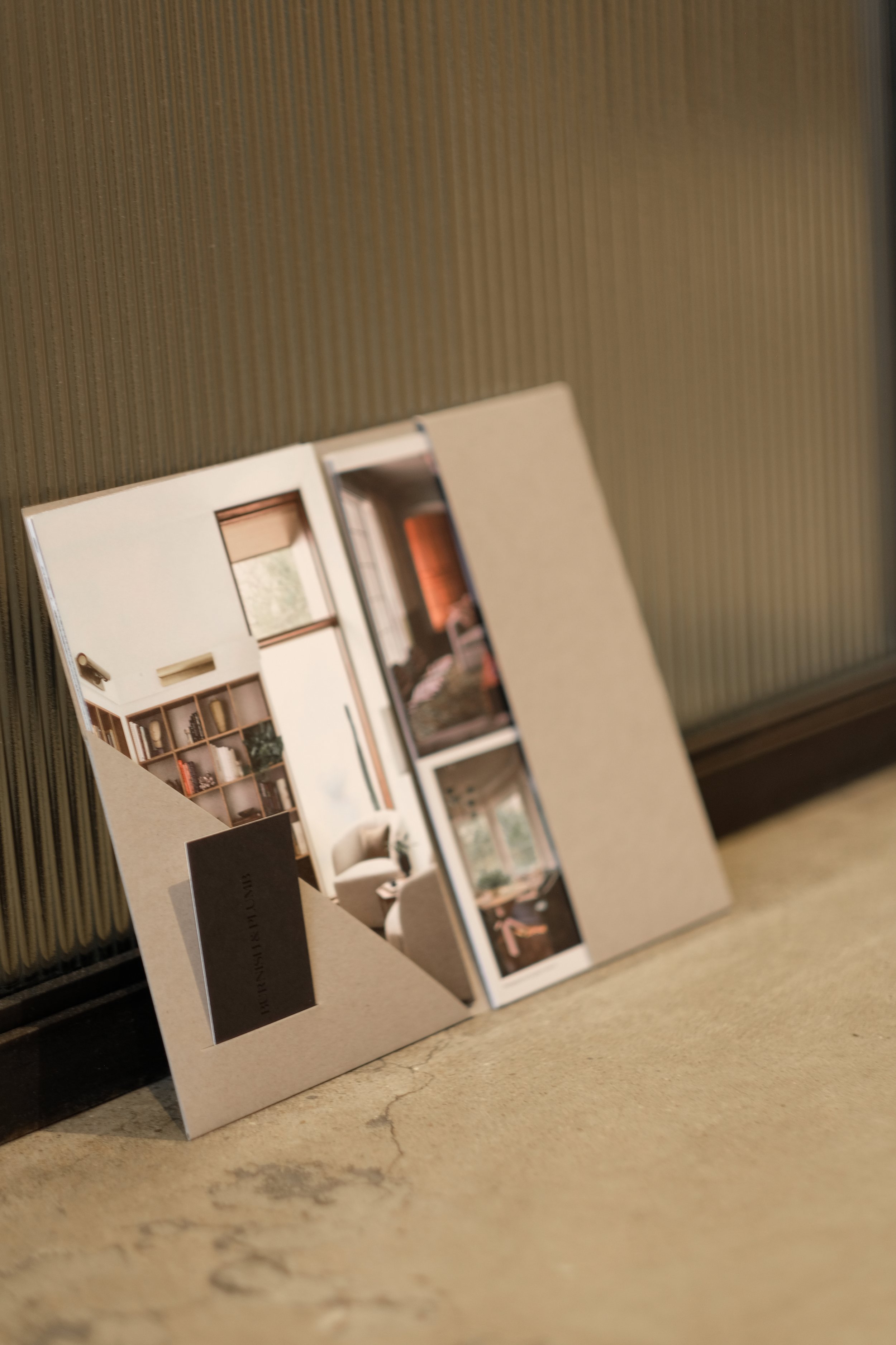
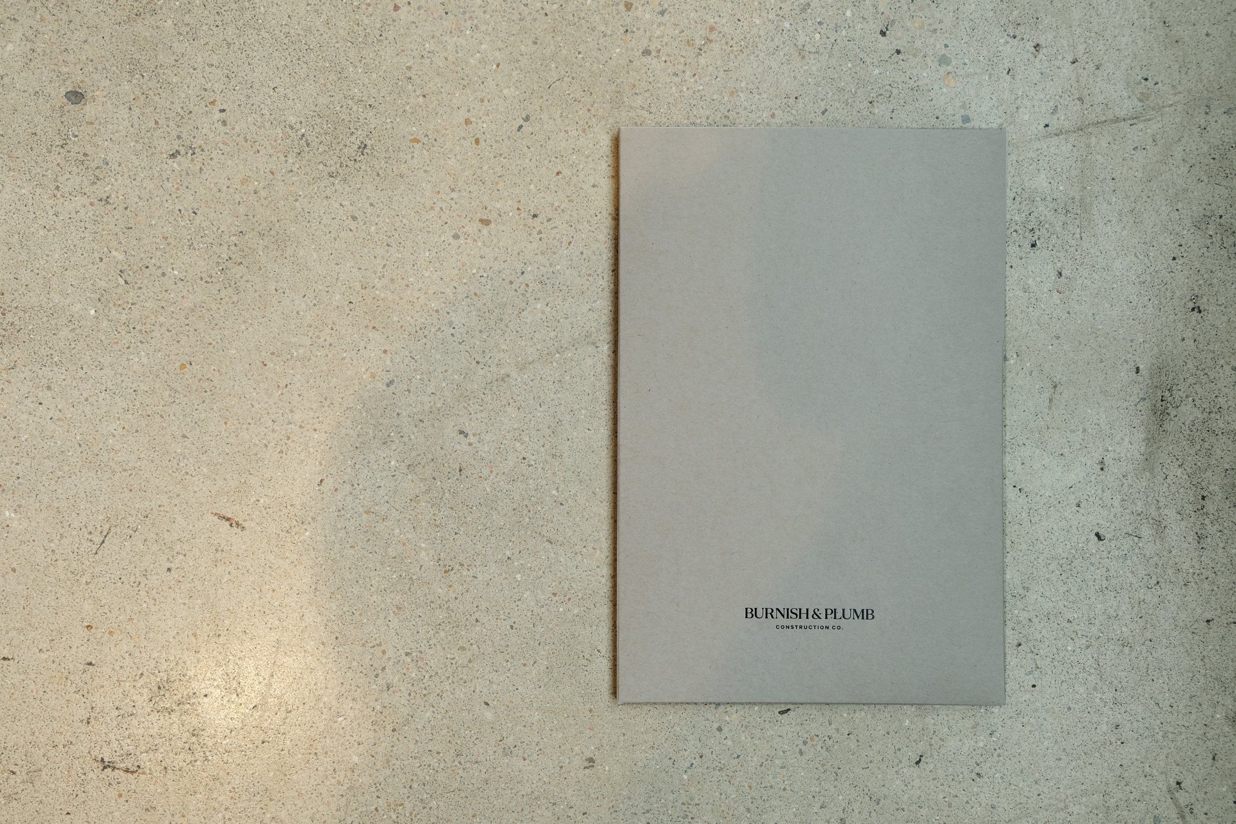
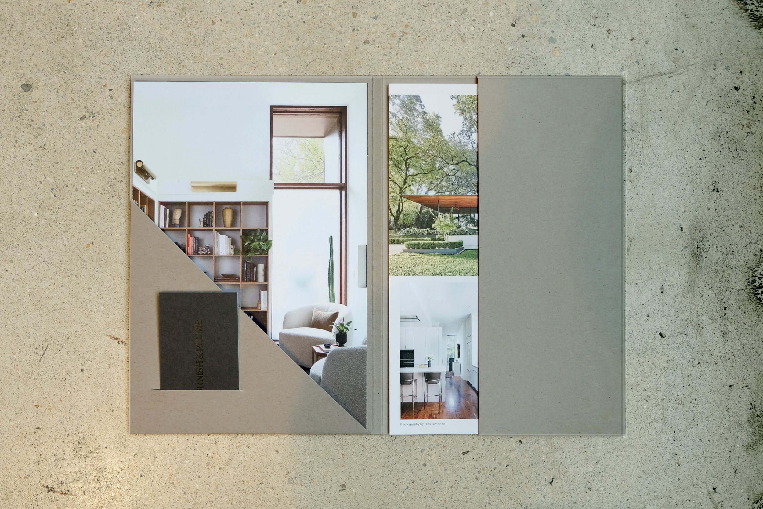
A discrete set of marketing materials and collateral is custom designed and produced for use in the field.
Taking cues from the built environment, the material palette includes raw natural leather, recycled paper made from stone, a toothy concrete-colored paper, tonal black letterpress evocative of blackened steel, and soft ‘gypsum’ grey color fields.


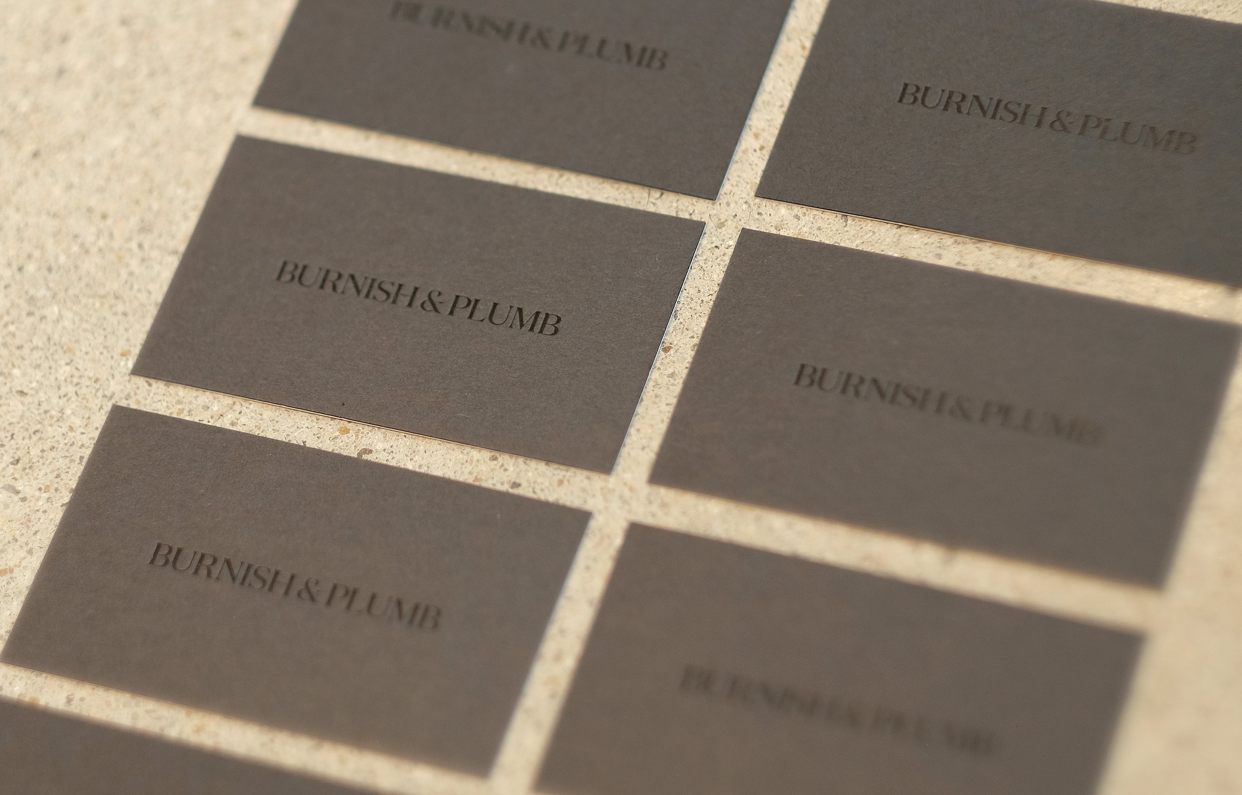


A versatile set of logo marks and graphics allow for appropriate application across digital environments and the physical world — from social media to liveries and signage.


Before
Burnish and Plumb’s previous identity was designed by FODA in 2012. While the award-winning design was appropriate in the moment, and there was recognition in the name — a visual refresh was needed to allow for a flexible system that more strongly aligned with its current audience and market.