

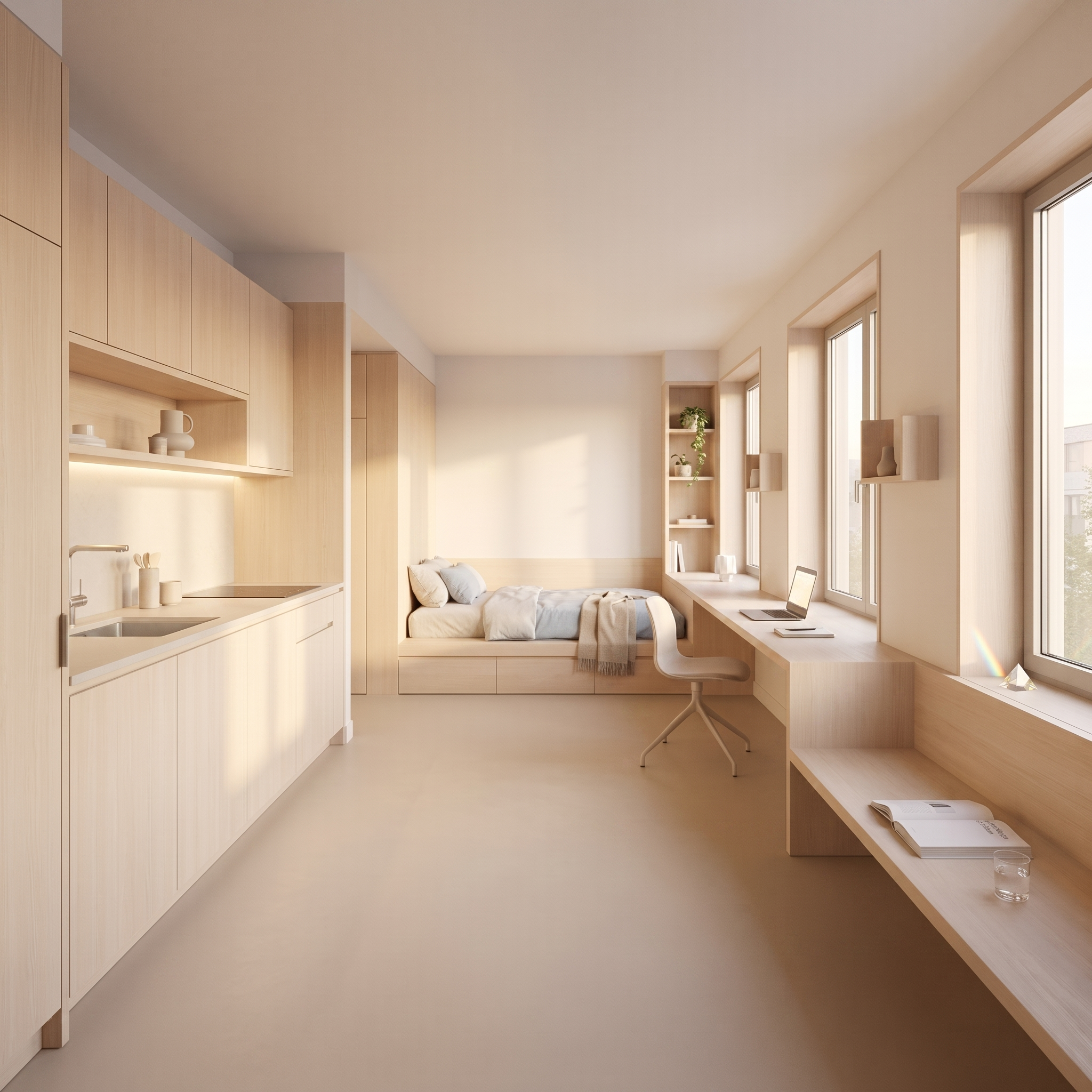
Sunroom
An organizational model for student living.
What if compact student living were designed as one integrated system for living—aligning human health, daily behavior, architecture, building systems, operations, and cost from the start?
Sunroom is an ongoing prototype exploring what happens when the unit is considered as a coordinated whole. Daylight, air, acoustics, materials, infrastructure, storage, daily routines, construction, operations, and the resident’s own layer of expression become part of the same design framework. A small set of coordinated moves aims to make healthier daily living easier, reduce operational friction, and get more performance from the space and resources already being invested.
New patterns of living: stable where permanence adds value. Changeable where identity matters.
Potential Services
Health-first Planning
Research + Design Strategy
Materials + Product Health
Operations + Cost Alignment
Workshops + Prototype Consulting
Potential Friends and Collaborators
Student Living Developers + Operators
Hospitality + Lifestyle Brands
Material + Soft-goods Manufacturers
Architects + Researchers
The Organizing Model.
Three zones.
One coordinated system.
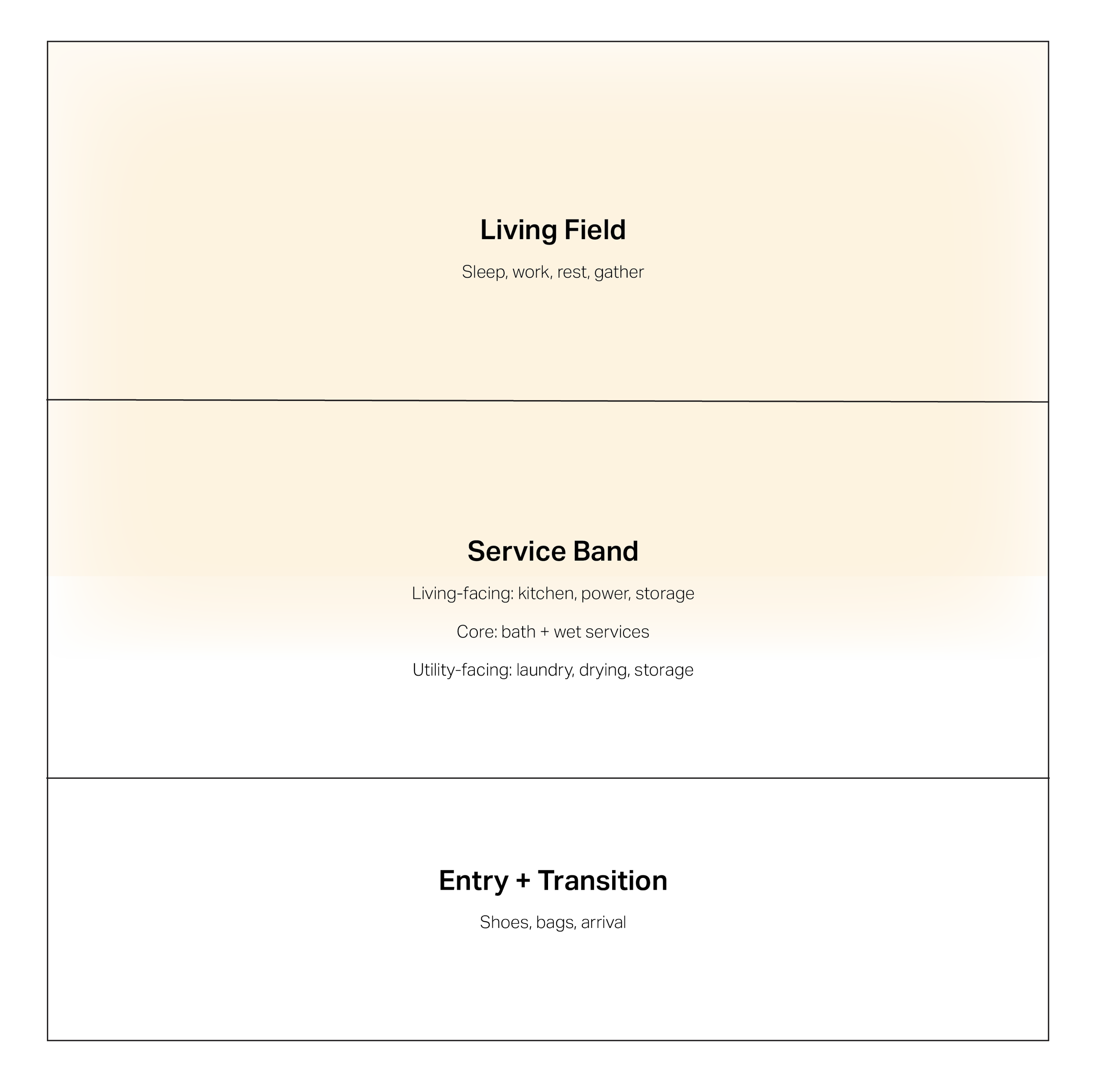
Organize around daylight
Put daily life where light does the most work.
The Living Field gives sleep, study, rest, and gathering the strongest relationship to daylight and views.
Concentrate infrastructure
Consolidate complexity so living space can stay simple.
A thickened, double-sided Service Band coordinates kitchen, bath, laundry, storage, power, and wet services within one architectural system.
Design the transition
Give outside life somewhere to stop.
Arrival gives shoes, bags, bikes, waste, and daily carry a dedicated place at the threshold.
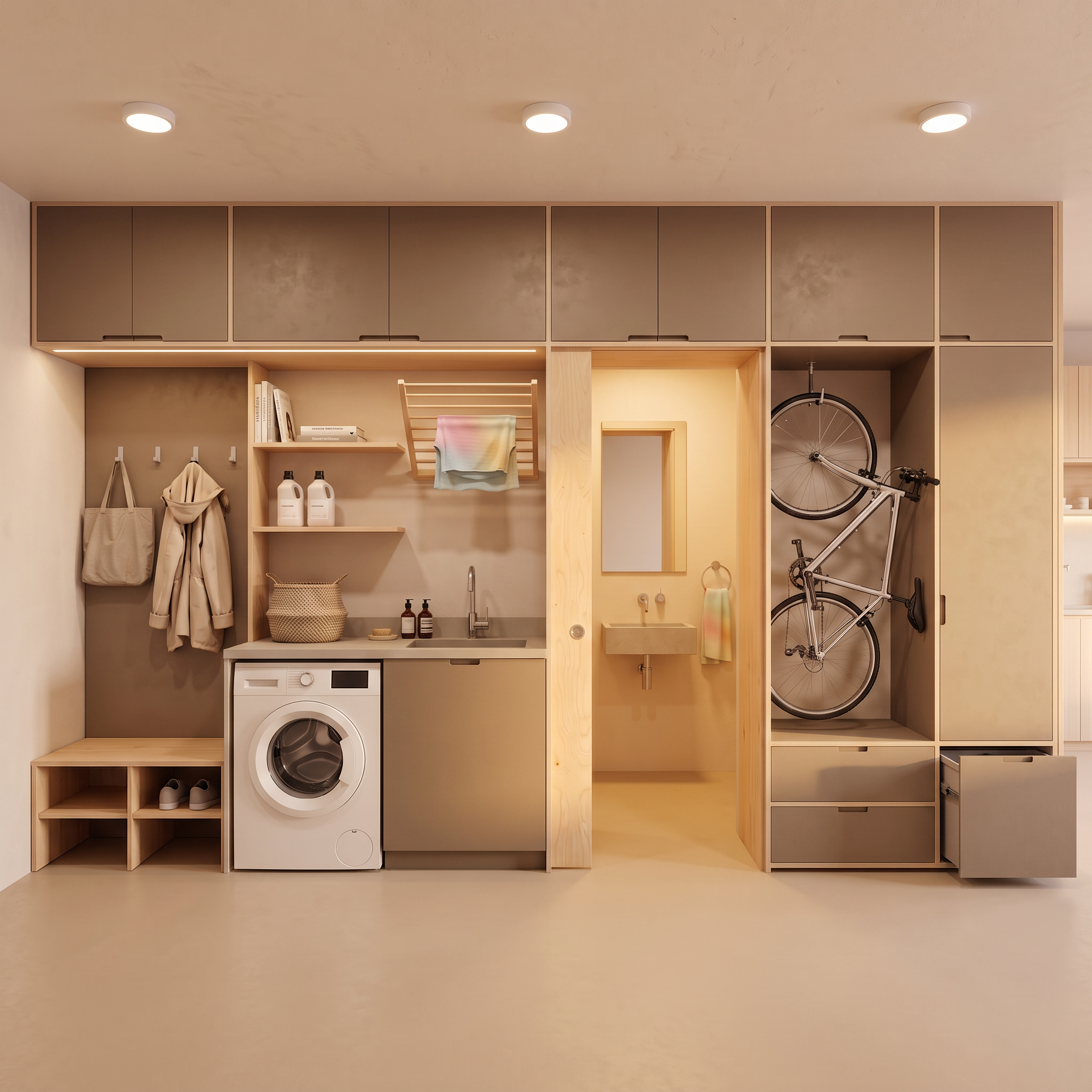
Design around routines
Organize sequences alongside square footage.
Arrival, bathing, drying, laundry, storage, and departure are planned as connected routines—so the architecture supports what happens before and after each task.
Build in what earns permanence
Built-in, not bought.
Work surface, daybed, storage, seating, lighting, and power are integrated where permanence can reduce clutter, exposed wires, replacement, and turnover wear. Cushions, bolsters, covers, and throws remain a replaceable soft layer—giving residents room for identity and change without requiring another layer of furniture. The architecture stays. The pattern can change.
Design materials for health + lifecycle
Health first. Built for turnover.
Low-emitting, durable, cleanable, repairable, recycled, and upcycled materials are integrated into one lifecycle strategy—informing the architecture from the start.
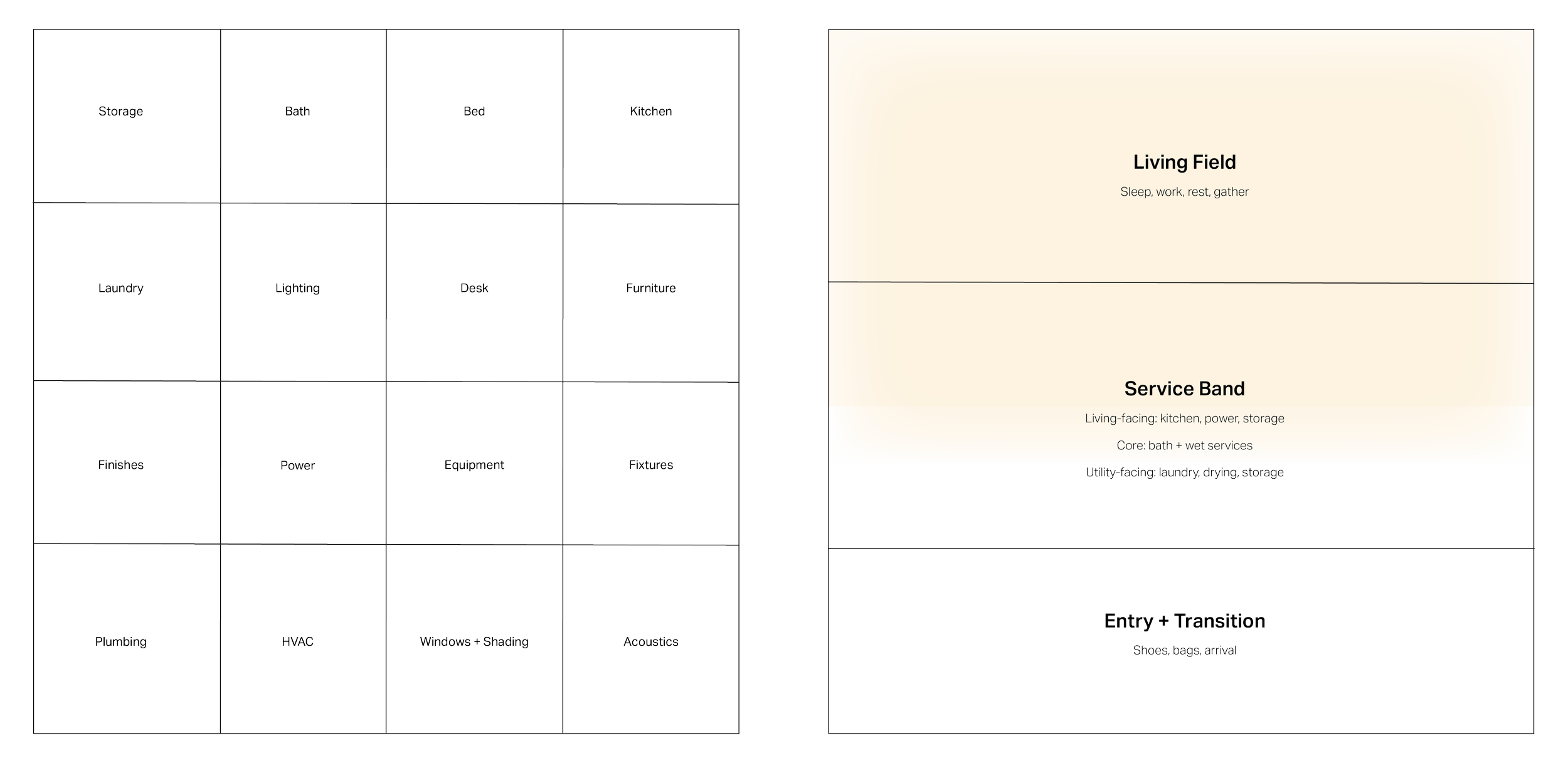
Repeat logic, not parts
One coordinated system, not a fixed kit of parts.
Student living is inherently repetitive. Sunroom carries a coordinated organizing logic across projects, without repeating the same fixed set of parts.
One system.
Multiple outcomes.
Healthier daily conditions, simpler operations, less turnover wear, more useful space, and room for personal expression—all from the same organizing logic.
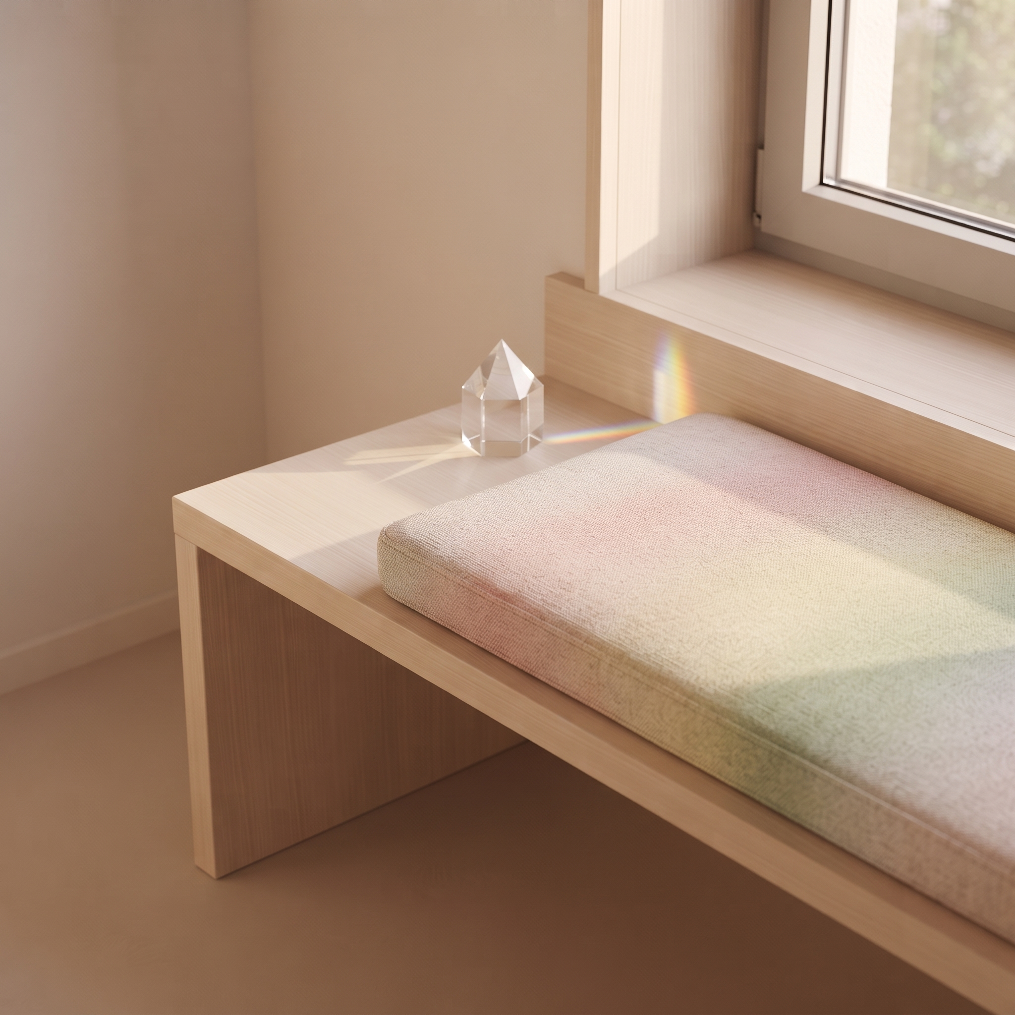
Sunroom is an ongoing prototype.
The architecture is designed for permanence; the soft layer is designed for change.
A customizable textile layer gives residents room for personal expression while preserving a durable, integrated framework.
Future testing can measure resident experience, health factors, operations, material lifecycle, construction coordination, and cost as one system.
The goal isn’t simply a better room. It’s a better-performing system for living.